
Did you know that visual elements can significantly enhance a book report’s impact? Creating an eye-catching book report poster not only helps you stand out in a classroom but also encourages creativity and deeper engagement with the material. If you’ve struggled with traditional text-heavy reports, this guide will show you how to transform your ideas into a visually appealing format that captures attention.
We understand that balancing information and aesthetics can be challenging. That’s where this guide comes in. You’ll learn essential design principles, from choosing the right colors to incorporating images and text effectively. By the end, you’ll not only have a captivating poster but also a greater appreciation for the story and themes you’re presenting. So, let’s dive into the steps to make a poster that not only informs but excites your audience!
Choosing the Right Theme for Your Poster Design
can make all the difference in how effectively it communicates your message. A well-chosen theme will resonate with your audience and reflect the essence of your book report, whether it’s a classic novel, a contemporary piece, or a work of non-fiction. Start by considering the genre and tone of the book. For example, if the book has a whimsical or adventurous plot, selecting a vibrant color scheme with playful fonts could enhance that feeling. Conversely, a serious or dramatic work might benefit from a more subdued palette and formal typesettings.
Next, reflect on the key themes and motifs within the book. These elements can serve as inspiration for your design and should be visually represented to reinforce the content of your report. You might select images that symbolize major plot points or use background patterns that evoke the setting of the story. For instance, a book set in a historical period might feature textures and colors typical of that time, while a science fiction novel could suggest a futuristic theme through sleek lines and metallic hues.
It’s also crucial to consider your audience. Tailoring your theme to the preferences and expectations of your viewers will make your poster more appealing. Younger audiences may respond better to dynamic and unconventional designs, while adult viewers might appreciate a more polished and sophisticated approach. Taking the time to align your theme with both the book’s content and your audience’s preferences will help create a more engaging and effective poster.
In summary, selecting a fitting theme for your book report poster involves a thoughtful combination of the book’s content, its genre, and the target audience’s characteristics. Experiment with different ideas while keeping these elements in mind to develop a poster that is not only eye-catching but also deeply connected to the message you wish to convey.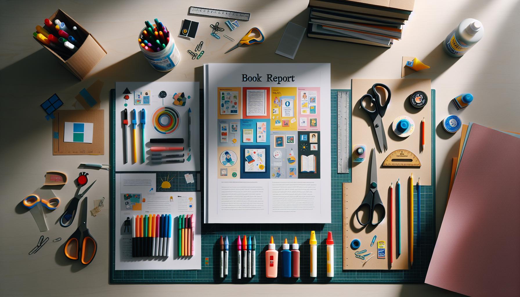
Essential Materials for Crafting Your Book Report Poster
Crafting an engaging book report poster doesn’t just rely on artistic flair; it requires the right materials that can support both creativity and functionality. The foundation of a successful poster begins with choosing the right medium. While traditional poster board is a popular choice, considering alternatives such as foam boards or even fabric can add a unique dimension to your presentation. Each material has its pros and cons-poster board is easy to find and work with, while foam board offers sturdiness and a professional finish.
Visual Elements are also critical in creating a compelling poster. Quality printed images or illustrations can significantly enhance the aesthetic appeal. Look for high-resolution graphics that resonate with the themes of your book. Depending on your artistic skills, you might also choose to hand-draw illustrations or use digital tools to create custom artwork. If you opt for digital, programs like Canva provide easy-to-use templates that can give your poster a polished look.
Text and Fonts
Text is another essential component. Selecting the right fonts can dramatically change the perception of your poster. Aim for a mix of readability and style-bold headers can draw attention, while a clear, concise font for body text ensures your audience can easily absorb the information. Consider using color-coded headings or different font sizes to help organize content hierarchically, making it easier for viewers to navigate through your report.
Lastly, don’t overlook the importance of adhesives and tools. High-quality glue, double-sided tape, or poster putty can be more effective than standard tape, preventing unsightly marks and ensuring a clean finish. Additionally, having scissors, a ruler, and markers on hand will help refine details and make adjustments as needed.
By combining the right materials and tools with thoughtful design choices, you can create a book report poster that effectively communicates your insights while engaging your audience.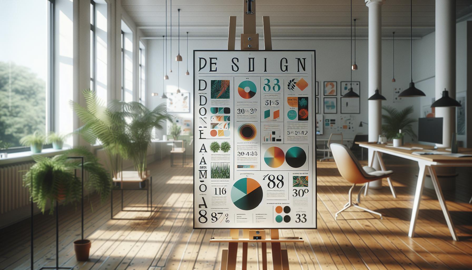
Design Principles for Eye-Catching Posters
Creating a book report poster that stands out requires more than just putting information on a board-it involves a strategic approach to design principles that can captivate and inform your audience. An effective poster should not only convey essential information but also engage viewers through thoughtful design choices.
A fundamental principle is balance, which refers to the visual weight distribution across the poster. You can achieve balance through symmetry or asymmetry; for instance, placing a large image on one side can be complemented by text or smaller images on the opposite side, creating an engaging interplay. Contrast is equally crucial; by contrasting colors and font styles, you can highlight important sections, making it easier for the audience to identify key ideas at a glance. For example, using a bold, bright color for headings against a softer background can draw attention and guide viewers through your content.
Incorporating white space effectively also enhances your poster’s readability. Open areas allow the viewer’s eyes to rest, preventing the poster from feeling cluttered. Aim for a clean layout that leads the viewer’s eye through the poster, ensuring that each element has room to breathe. A well-structured grid can help organize content logically, while grouping related information together encourages digestion of complex ideas.
Lastly, consider scale and proportion. Large images or bold titles can create focal points that draw attention, while smaller details should support rather than overwhelm. For instance, reserving the largest font for the title of your book along with a striking cover image helps anchor your poster visually, making a strong impression right from the start. By keeping these design principles in mind, you can craft an eye-catching book report poster that not only presents your insights compellingly but also stands out in any setting.
Incorporating Visual Elements: Graphics and Colors
Creating a visually engaging book report poster involves skilled use of graphics and color to draw in the audience and convey information effectively. One essential aspect is the careful selection of graphics that align with the theme of your book. For instance, if you are reporting on a nature-themed book, including images like landscapes or wildlife can profoundly enhance the visual appeal. These graphics serve not just as decoration but as vital storytelling elements that reinforce the textual content. High-resolution images or illustrations can act as focal points, inviting viewers to explore more about the characters, settings, and themes encapsulated in your report.
Color theory plays a crucial role in poster design, as colors evoke emotions and set the tone for your content. When choosing a color palette, consider using complementary colors to create a balanced and pleasing aesthetic. For example, if the theme of your book is adventurous, colors like blue and orange-contrasting yet harmonious-can convey excitement. Utilizing a limited color scheme, such as two or three main colors, helps to prevent visual overload, ensuring essential information stands out. Moreover, applying color psychology can guide your audience’s emotional responses; warmer colors like reds and yellows can create a sense of urgency or excitement, while cooler colors like blues and greens often evoke calmness and stability.
Using Visual Hierarchy
Another critical principle is to establish a visual hierarchy through your design choices. This involves arranging visual elements in a way that signifies their importance. For example, the title of your book should be the most prominent feature-large, bold, and in a color that draws attention. Supporting graphics, such as character images or significant quotes, should follow in size and prominence, thereby guiding the viewer’s gaze across the poster in a logical sequence. Implementing design elements like borders or frames around key graphics can further emphasize their significance, creating a structured flow that leads the audience through your message.
Incorporating visual elements requires balancing creativity with clarity. While it’s essential to showcase your personality and enthusiasm for the book, every choice-from the images selected to the colors applied-should serve a purposeful role in conveying your overall message. By thoughtfully integrating graphics and colors, you can not only make your poster visually appealing but also transform it into an effective communication tool that resonates with your audience.
Adding Text Effectively: Fonts and Layouts
Choosing the right fonts and layouts is crucial for ensuring your book report poster is both effective and aesthetically pleasing. Typography not only conveys information but also establishes a mood that reflects the theme of your book. When selecting fonts, consider using contrast to create a visual hierarchy. For instance, pair a bold, sans-serif font for your title with a cleaner, serif font for the body text. This combination not only enhances readability but also directs the viewer’s attention to the most important textual elements.
Choosing the Right Fonts
When choosing fonts, clarity should be your priority. Fonts that are too decorative can distract from your message. Aim for a maximum of two or three different fonts to maintain visual coherence. Common choices for title fonts include Arial, Impact, or Bebas Neue, while body text can be effectively conveyed with fonts like Times New Roman, Georgia, or Arial. Additionally, consider the size and weight of your fonts; larger and bolder fonts for titles catch the eye, whereas smaller and lighter fonts are better suited for detailed descriptions.
Effective Layout Strategies
The layout of your poster is just as important as the fonts you choose. A well-structured layout can guide your audience’s eyes naturally from one element to another. Here are some practical strategies:
- Grid Alignment: Use grid systems to align your text and images. This creates a clean, organized look that is easy to navigate.
- White Space: Don’t be afraid of white space; it helps to prevent clutter and allows important text to stand out.
- Vertical and Horizontal Flow: Arrange your text in sections, either in columns or rows, so viewers can read easily and quickly absorb the information.
Combining Text and Visuals
Your layout should seamlessly integrate text with visuals. For example, you might want to place a significant quote from the book in a larger font size over a visually appealing background image or a box that contrasts with the rest of the poster. This technique not only draws attention but also enhances the impact of the text.
In summary, effective typography and layout design significantly impact the clarity and engagement of your book report poster. Keeping your fonts readable and your layout clean allows your audience to focus on the content, making your poster not just an artistic expression, but a powerful communication tool.
Tips for Including Key Details and Highlights
Captivating details are the backbone of an effective book report poster, ensuring that your audience can grasp the essence of the book quickly. Start by identifying the key themes, characters, and any significant twists in the plot that define the narrative. Use bullet points to succinctly present these highlights-this aids in breaking down complex information into digestible segments. For instance, an impactful book might show its protagonist’s development through brief descriptions of key events that signify growth, which could be presented as follows:
- Character Arc: “The protagonist starts as a timid individual but evolves into a confident leader by the end.”
- Major Theme: “Exploration of friendship and betrayal in unexpected contexts.”
- Plot Twist: “The unexpected betrayal of a trusted ally reshapes the protagonist’s journey.”
Utilizing visuals to emphasize these details can enhance engagement. Consider incorporating images or icons that symbolize pivotal moments or themes. For example, if a book revolves around a journey, a small compass graphic alongside the plot summary can visually connect the concept. Moreover, colors can reflect emotions or themes-warm tones may represent passion or conflict, while cooler tones could denote calmness or resolution.
In addition, including compelling quotes can lend authenticity and depth to your insights. Choose brief yet powerful excerpts that encapsulate the book’s core message or highlight a significant turning point. Pair these quotes with backgrounds that resonate with the mood of the quote, making sure they are legible against the backdrop.
Finally, strive for a balance between text and imagery. While it’s essential to provide enough information to inform your audience, too much text can overwhelm them. Aim for a concise and clear representation of the primary details, allowing your creative elements to draw attention and facilitate understanding of the book’s larger context. By carefully curating and presenting these key details, your poster will not only inform but also captivate, leaving a lasting impression on your viewers.
Showcasing Your Creativity: Unique Poster Ideas
Creating a book report poster is an opportunity to not only convey information but also to showcase your creativity. Think beyond traditional layouts and consider how you can incorporate unique elements that reflect the essence of the book while making your poster stand out. Here are some innovative ideas that can elevate your project and engage your audience.
Transform Your Poster Into an Interactive Experience
Engagement can be enhanced significantly through interaction. Instead of a flat poster, why not create a tri-fold display that allows viewers to explore different aspects of the book more dynamically? Attaching small envelopes containing discussion questions or character profiles can encourage your audience to interact with the material. Alternatively, you could use QR codes linked to book trailers, author interviews, or online discussions, turning your poster into a portal for deeper engagement.
- QR Code Links: Embed QR codes that connect to external content for a modern touch.
- Interactive Elements: Use flaps or sliders that reveal different aspects of the plot or character details.
- Mini-Challenges: Include puzzles or quizzes related to the book that viewers can solve on the spot.
Incorporate Thematic Colors and Textures
The colors and textures you choose can dramatically affect the visual storytelling of your poster. Think about how these elements can evoke the book’s atmosphere. For example, a fantasy novel might benefit from shimmering, ethereal textures while a mystery might utilize dark, moody colors and rougher surfaces. You can enhance your poster with materials such as fabric, colored paper, or even metallic foils to create a tactile experience.
Here’s a quick comparison of how color choices can evoke different themes:
| Color | Associated Emotion/Theme | Example Usage |
|---|---|---|
| Red | Passion, Conflict | Highlighting a love story or a tumultuous event |
| Blue | Calm, Trust | Portraying peaceful settings or stable relationships |
| Yellow | Joy, Energy | For uplifting themes or comedic elements |
| Purple | Mystery, Imagination | Focusing on fantasy themes or complex plots |
Use Unconventional Shapes and Formats
Dare to deviate from the standard rectangular format by experimenting with shapes that relate to your book. If the book is centered around a circular event, such as a journey that brings characters full circle, creating a circular poster could resonate well. Alternatively, using a shape related to the main character or a significant symbol from the book could create a unique visual impact and encourage viewers to examine the poster closely.
Whether it’s layering cutouts of shapes to create depth or using a pop-up element that draws attention to a pivotal quote, these imaginative formats can leave a lasting impression on your audience.
By implementing these ideas, you can transform a standard book report poster into a vivid expression of creativity that not only conveys essential information but also captivates and inspires your audience. Embrace the opportunity to make your work colorful, interactive, and inventive.
Engaging Your Audience: Presentation Tips
Captivating your audience goes beyond simply creating an attractive poster; it is about how you present and engage with your viewers. The moment you unveil your poster, think of it as a stage where you can invite others into the world of the book you’re showcasing. By utilizing strong presentation techniques, you can turn passive observers into active participants, creating a memorable experience that resonates long after your presentation has ended.
One effective way to engage your audience is through storytelling. Begin your presentation by sharing a compelling anecdote or a thought-provoking question related to the book. This can pique interest immediately and encourage your audience to think critically about the themes you will discuss. For example, if your book report is on a coming-of-age story, you might share a brief personal experience that ties into the theme of growth and self-discovery, framing your insights as reflections while inviting the audience to relate their own experiences.
Incorporating interactive elements can also elevate your presentation. Consider asking your audience to participate in a brief quiz about the book as you display key features of your poster. This not only makes the session dynamic but also reinforces their retention of the material. You might present questions related to significant plot points or character motivations, allowing viewers to respond by raising their hands or writing their answers on sticky notes to place on the poster. This kind of engagement fosters a sense of community and collaboration.
Additionally, your body language and delivery style play a crucial role in maintaining engagement. Utilize eye contact, vary your tone, and modulate your pacing to emphasize important points. Moving around the room rather than standing behind a table can make you more approachable and create a connection with your audience. When discussing specific sections of your poster, lean in slightly or gesture toward the visuals-this approach invites your viewers to share in your enthusiasm for the material and keeps their attention focused.
Lastly, be open to questions and feedback from your audience. After your presentation, encourage a discussion by prompting the audience with open-ended questions about the themes or characters. This can be a wonderful way to delve deeper into the material, allowing for multiple perspectives and insights. Creating an interactive dialogue not only enriches your understanding of the book but also solidifies the audience’s connection to the content you’ve presented. Embrace the opportunity for conversation, and you’ll leave a lasting impression that transcends the simple act of displaying your book report poster.
Examples of Inspiring Book Report Posters
Creating a book report poster offers a unique opportunity to express creativity while encapsulating the essence of a book. By looking at successful examples, you can find inspiration and practical ideas for your own design. Some remarkable book report posters stand out due to their visual appeal and engaging content, showcasing how aesthetic choices and clear information can work in harmony.
One striking approach is to utilize a visual theme that resonates with the book’s setting or overall mood. For instance, a poster for a dystopian novel might use darker hues and gritty textures to create an unsettling atmosphere. Through images of decaying urban landscapes or foreboding skies, the poster can evoke the book’s tone. Conversely, a poster for a vibrant adventure novel could incorporate bright colors and dynamic graphics, showcasing key scenes or characters in action.
Layout is another crucial aspect of poster design. Engaging examples often use a balanced layout that combines images and text effectively. For example, consider a poster featuring a central image of the protagonist, surrounded by quotes from the book and a brief plot synopsis. This layout draws the viewer’s eye and invites them to delve deeper into the content. A well-placed border or thematic background can further enhance the cohesion of the poster, making it visually appealing.
Additionally, incorporating interactive elements or QR codes linking to book trailers or author interviews can bring your poster to life. This not only provides more context but also encourages the audience to engage with the material beyond the visual presentation. For example, a poster on a fantasy novel might include a QR code that takes viewers to a visual tour of the book’s world, expanding their understanding and interest.
In essence, the inspiration for a book report poster can spring from both content and design techniques. Whether by harnessing the emotional power of colors and imagery or integrating interactive components, successful posters resonate with audiences and convey the story vividly and compellingly. Embrace these examples as a foundation for your own creative journey in poster design-you’ll not only capture attention but also spark curiosity about the books you love.
Common Mistakes to Avoid in Poster Design
Creating a visually appealing book report poster can enhance comprehension and engagement, yet common pitfalls often undermine these efforts. Recognizing and avoiding these mistakes not only saves time but also elevates the impact of your design.
One frequent misstep is overcrowding the poster with too much information. While it may be tempting to include extensive details such as summaries, character lists, and quotes, this can overwhelm viewers. Instead, aim for concise, high-impact content. Use bullet points or short phrases to communicate essential ideas, allowing for better readability. A clean, organized layout enhances focus and ensures that your central message captures attention.
Another error often seen in poster designs is the misuse of color and font. Vibrant colors can be eye-catching, but using too many contrasting colors can create visual chaos. Stick to a palette of four or five colors that complement each other and reflect the book’s tone. Similarly, fonts should be chosen wisely-opt for legible typefaces and use variations (bold, italic) sparingly to emphasize key points without diminishing readability.
Lastly, neglecting the importance of visual hierarchy is a common mistake that can impede communication. Ensure that the most critical elements, such as the title and key visuals, stand out prominently. Use larger fonts and strategic placement to guide the viewer’s eye naturally through the poster. Incorporating white space can also offer the necessary breathing room for your design, enhancing overall impact.
By consciously avoiding these typical mistakes, you can create a book report poster that is not only informative but also striking and easy to navigate, inviting viewers to engage deeply with the content you present.
Resources for Further Inspiration and Learning
Engaging with creative inspiration and resources can elevate your book report poster from average to exceptional. One influential aspect of design is understanding the myriad of visuals you can incorporate to communicate your insights effectively. Websites such as Canva offer free customizable poster templates, including specialized designs tailored for educational projects. Browsing through their extensive library can spark innovative ideas and provide a professional-looking foundation for your work. Check out their design options here for meaningful visuals that align with your poster’s theme.
Another valuable resource is platforms that host creative communities, where feedback can help refine your poster. Websites like Behance allow users to share their creative works, gaining inspiration from peers while also connecting with design critiques. This environment encourages experimentation and learning, pushing you to think outside the box about how to present your content visually. Additionally, Pinterest is an excellent tool for discovering poster ideas and trends. You can pin designs you love, serve as mood boards, or collect layout inspirations that align with your book’s themes.
Utilizing educational resources can also improve your understanding of design principles. Websites offering online courses, such as Udemy or Coursera, provide modules focused on graphic design basics or specific aspects of poster creation. These platforms can deepen your knowledge of layout composition and color theory, critical skills for making eye-catching posters. Furthermore, engaging with content from art and design blogs can present case studies on successful poster designs and their creation processes, enhancing your practical knowledge and providing you with tips directly applicable to your project.
In sum, leveraging both creative platforms and educational resources will not only offer the tools needed to craft a stunning book report poster but also foster a mindset of exploration and creativity. By immersing yourself in these resources, you’ll be better positioned to make impactful design decisions that resonate with your audience while effectively conveying your book’s themes.
Faq
Q: What materials do I need to create a book report poster?
A: To create a book report poster, you will need poster board, markers, scissors, glue, and printed images. Additional materials like stickers or glitter can enhance your design. Check out the Essential Materials for Crafting Your Book Report Poster section for more detailed suggestions.
Q: How can I choose a theme for my book report poster?
A: Choosing a theme is critical for your book report poster’s impact. Reflect on the book’s main themes or characters, and let this guide your colors and images. For insights, visit the Choosing the Right Theme for Your Poster Design section in the article.
Q: What are effective design principles for my poster?
A: Effective design principles include maintaining balance, contrast, and alignment. Keep your layout organized to guide viewers’ attention. Refer to the Design Principles for Eye-Catching Posters section for more guidelines to elevate your poster design.
Q: How do I effectively use visuals in my poster design?
A: To effectively use visuals, opt for bright, relevant graphics that relate to your book. Limit the number of images to avoid clutter and maintain focus. Check the Incorporating Visual Elements: Graphics and Colors section for additional tips.
Q: What fonts and layouts are best for my book report poster?
A: Use bold, legible fonts for headings and simpler ones for body text to ensure readability. A structured layout with clear sections enhances your poster’s effectiveness. For specific font suggestions, explore the Adding Text Effectively: Fonts and Layouts section.
Q: How can I showcase my creativity in the book report poster?
A: Showcase creativity by using unusual materials, such as fabric or handmade crafts, and incorporating personal touches that reflect your style. The Showcasing Your Creativity: Unique Poster Ideas section provides more inspiration.
Q: What are common mistakes to avoid when designing my poster?
A: Avoid cluttering your poster with too much text or imagery, using contrasting colors that clash, and neglecting layout balance. Familiarize yourself with these pitfalls by reviewing the Common Mistakes to Avoid in Poster Design section.
Q: How can I make my presentation engaging when showcasing my poster?
A: To engage your audience, maintain eye contact, vary your tone, and encourage questions. Practicing your presentation beforehand helps you feel confident. Find more tips for engaging your audience in the Engaging Your Audience: Presentation Tips section.
In Retrospect
Congratulations on mastering the art of creating an eye-catching book report poster! By incorporating vibrant visuals and relevant themes, you’ve not only engaged your audience but also deepened your understanding of the material. Don’t let your creativity stop here! To elevate your design skills further, check out our guides on “Color Theory for Effective Design” and “Creative Presentation Techniques” for more tips that will enhance your projects.
If you’re ready to take your skills to the next level, sign up for our newsletter for exclusive resources, design tools, and the latest articles delivered straight to your inbox. We value your feedback, so feel free to share your thoughts in the comments below or ask any questions about your poster design journey. Join our community of enthusiastic learners and transform your academic projects into standout presentations! Your next masterpiece awaits!
Get our latest guides, news, and insights highlighted in your Google Search & AI Overviews.